February 20, 2013

Master Bathroom Paint

Although our bathroom is far from 'done', I did want to share the paint color. I attempted to match the lightest shade in our new shower curtain and find something light gray/blue...so we went with Gray Cloud by Benjamin Moore. It still amazes me how differently a color can look from the swatch to the wall...and admittingly, I picked this color out quickly. It's a bit too blue for my tastes, but it works so well in the bathroom and really does tie-in the shower curtain nicely.


We are in the home stretch in the master bathroom and just need a few more things done. Our main project is painting the old wooden vanity (not sure if we should go white or dark brown) and framing out our builder-grade bathroom mirror. After those two projects I just need to pick out a shelf, some frames and vanity top accessories!
 

February 18, 2013

The Master Bedroom: Before and Progress

Finallllllly. We're not completely done, but the only thing left to do in our bedroom is decorate. And furniture. Okay, okay, all we really have is a bed, but at least the painting is done!
 
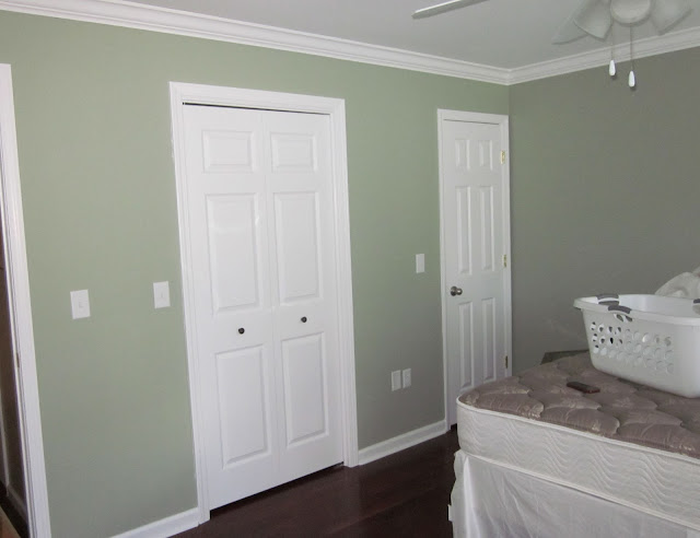
Let me just say this room was really hard work...the sheer size alone made installing trim, caulking and painting take forever and we also installed five new windows and four new doors. The color came out darker than we were expecting, but I still love it and it's calming and relaxing, which is perfect for a bedroom. So let's take a look at some pictures, shall we?
 
Here is the room when we first bought the house (I stole these from my House Tour page - sorry):


Between then and the photo below we put in 'smooth' ceilings and installed crown molding. Below we were in the midst of nailing in the quarter-round and I had a few paint samples on the wall:


After the new windows and freshly painted trim:


And now......The color again is Benjamin Moore's Saybrook Sage:


As I said before, the room still needs practically everything...so I made a list:

  • Headboard
  • Nightstands
  • Curtains
  • Artwork/Frames
  • Long dresser
  • Tall dresser
  • Standing mirror
  • Rug
  • Bench/stool for foot of the bed
That's all I can remember for now. Our main concern is getting the nursery finished and the rest of the house done before coming back into this room to round it out. Meanwhile, I have been checking Craigslist for any good furniture.

February 14, 2013

The Nursery: Ideas

(So I starting writing this post yesterday and in the last 24 hours I actually changed my nursery ideas yet again. Can't make this up.)

I've been known to change my mind often when planning out a room...but this nursery is ridiculous. Not sure if we can blame it on hormones or pregnancy in general, but I cannot seem to get it together with this project. Much of the reason (I think) is that (a) I'm am not girly and (b) patterns and bright colors give me anxiety. So just take a second to Google 'girl's nursery' and come back when you're finished. Done? Yea, welcome to my world. WHY do 92% of the nurseries out there have to be so loud? Loud colors, crazy patterns and 'themes' (gag). Initially I wanted to go neutral/gray/greige, but I knew that a baby's room was my one opportunity to go outside my comfort zone. Of course, outside my comfort zone is problem most people's 'safe' bet. 
 
Anyway, after some internet/pinterest searching, I was convinced that BM's La Paloma Gray was the one. Just to be sure, I bought two other samples...one was Portland Gray (and the other I cannot remember the name of). Here they are on the wall:
 
 
The first color was supposed to be gray, but it looked so blue - I hated it. The second was my La Paloma...and it sucked. It was darker, grayer and more depressing than I could imagined. The third was Portland Gray and even though it has very lavender tones, I actually kinda liked it. I mean, in what other room will I ever be happy to see purple tones? My only complaint about Portland Gray was that it was just too light for the look I wanted. That weekend I decided I would try one shade down on the strip and go for Elephant Gray. I also found a great fabric that was girl-ish, but remarkably not super busy or too kid-ish. First, here is Elephant Gray (excuse the lighting - this room has very little natural light):


 I loved it. Brian loved it. Everyone I sent a picture to liked it...so what is the problem? The only trepidation I have is that the color seems too dark for a room with little to no sunlight. How do we solve that? Well, my first thought was board and batten. I have jumped on and off the board and batten bandwagon probably ten times since we started this nursery. We want it, we like the look of it, but it's just a lot more manpower and money that could easily be used elsewhere. The biggest issue is that most existing baseboards don't work (aka: don't line up) with board and batten...and Brian and I are just way too anal retentive to let that fly. Thankfully my husband is sometimes even more rational than I am...and we talked ourselves out of doing any kind of wainscoting in the nursery.
 
Enough about paint, right? Let's talk furniture. We already own the Ikea Hemnes Dresser in White, which will be transplanted from the guest room to the baby's room:


For a rocking chair, I racked my brain for at least a month trying to decide on which way to go. I just could not justify paying $800-$1,000 for a upholstered rocker and there was nothing on Craigslist. Then I thought of going with a stationary chair and re-upholstering the one we have from my in-laws. Honestly, that just seemed like a waste of money too. So who saved the day? Ikea, of course. Meet the Poang Rocker: Okay, it is a bit more modern than I would normally go...but it's comfortable, affordable and once you throw a pillow and blanket on it, look how good it can look:

{via}
 
Our friends had generously given us a free crib that they had, but I needed to add a few more 'big-ticket' items to my registry and ended up falling for the Graco Mason Crib from Target. It's also very cheap and I love the straight, classic (almost modern) lines.
 
Those are the three basic pieces we have for now...eventually I would like to find an area rug and put up some ledges for books. Above the crib, I was thinking of getting a large version of this fawn print:
 

{via}
 
Well, that's where we are so far. Who knows what else I can change my mind about between now and May. This weekend our to-do list includes: installing crown molding, new doors, quarter-round on the baseboards, new window and hopefully priming all the old wood trim. Wish us luck!


February 11, 2013

Master Bathroom: The Update

Remember when I said I hate bathrooms? Well, now I hate ours just a little more than before:

 
I went food shopping and this was the crime scene I walked into when I got home. Apparently, once Brian took the old toilet out, the water in the pipes decided to leak through the ceiling and the can light in the kitchen. It only got better too. Later, while taking a shower in the downstairs bathroom, I hear Brian run down the stairs and then immediately my water turns off. Huh? Well, he needed to cut the sub-floor surrounding the toilet pipe and figured he would try and be careful instead of shutting off the water. Needless to say, the saw nicked the pipe and water was gushing up into Brian's face. (Okay, you're allowed to laugh). Is the bathroom really to blame? Probably not...but come on.
 
What else went wrong? Well, we decided to go out and purchase the precious Carrera Marble tile that we were in love with. But first we took out the calculator. Between material, labor and grout, we were looking at $1,000. Time out. Was this really worth it? Was our house and neighborhood really 'marble-worthy'? The answer was always no. We're expecting a baby...how could we really justify blowing so much money on this nice tile when all the homes for sale in our neighborhood have laminate kitchen counters? So the decision was made...we nixed the marble and went back to the drawing board. These were the new contenders:
 
 
The winner was the tile at the bottom of the stack. Simple, beige-y and most of all...cheap. First step was to remove the old tile. Our previous owner, who I swear did all home improvements intoxicated, did not disappoint...he tiled over the original laminate. Brian had to rip out the tile, the backer-board and then the laminate. Aside from that we got rid of the old toilet, the weirdly-placed medicine cabinet, the vanity top and patched the holes in the walls and . Check out the progress shots:


I forgot to mention another cost-related reason we ditched the marble...the vanity top. We made a trip and looked at granite remnants and even though it seems cheap at first, when you really put the cost of granite in our bathrooms and (hopefully) in our kitchen...it once again made no sense. Magically, the most perfect-for-our-situation vanity top appeared at Lowes. It is a solid surface, which top (with the sink as one piece) and it was only around $200! Check it out:


Wait, let's get back to the floor. Here is the subfloor:
 
 
The tile backer-board that we put down:
 
 
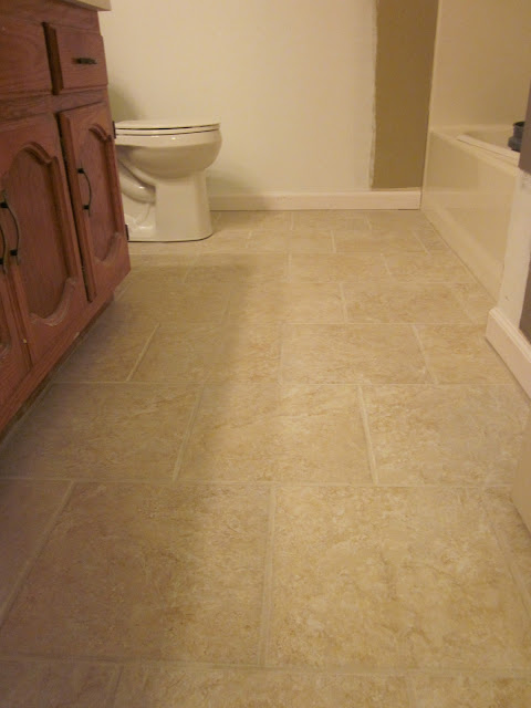
And....ta-da, the finished floor:


We also got a new toilet:
 
 
Now here are a few more shots of the new vanity top and the faucet we ordered from Overstock. I normally hate online shopping, but this faucet was really true to it's photo, it shipped quickly and it was affordable!


We also re-shelved and painted the inside of the linen closet:


Okay, I know that was a lot of pictures in one post, but we're almost done with this room. In the past few weeks we've painted the walls (don't love the color too much, but that's another story), painted the trim and bought a new shower curtain. Our next big task in here is framing out the builder mirror and painting that wood vanity.